Here at iridium peach the design process begins with a discussion with you, the client, on what needs to be accomplished. Then we gather, and/or create, the content to meet these needs. Then with the amazing power of WordPress we create amazing website layouts that are beautiful, fast-loading and responsive to all devices from a XXL desktop down to a mobile phone.
In website design there are three main areas. They are:
- Header
- Main content
- Footer
This post explains the layout pertaining to the main content of a web page.
Row and column components are used to organize and present content in a visually appealing and user-friendly way.
Row components can have anywhere between one and six columns, which can be mixed and matched to create a variety of different layout options.
Within any column, any number of website components such as text, videos, buttons, or graphics can be placed to create a visually attractive and functional website.
The best layouts for a particular website will depend on the type and amount of content, as well as the overall goals and audience of the site.
What follows is best seen on a large 4k monitor to best understand just how powerful and flexible iridium peach layout designs are. This is because we design for XXL displays first and then tweak the settings so that as the display size changes the layout will shift to suit. This is the best way to create responsive design.
The websites that iridium peach design all use WordPress with free themes and plugins. The reason for this is that they are free of code bloat, which slows down how quickly the page loads. This is super important because if someone doesn’t see the page load in less than 4 seconds most will leave. Premium themes and plugins come with all the bells and whistles and the slow speed.
Here at iridium peach we have discovered that you can create almost any layout with the following.
WordPress theme – Blockpress
Greenshift page builder plugin.

One column layout
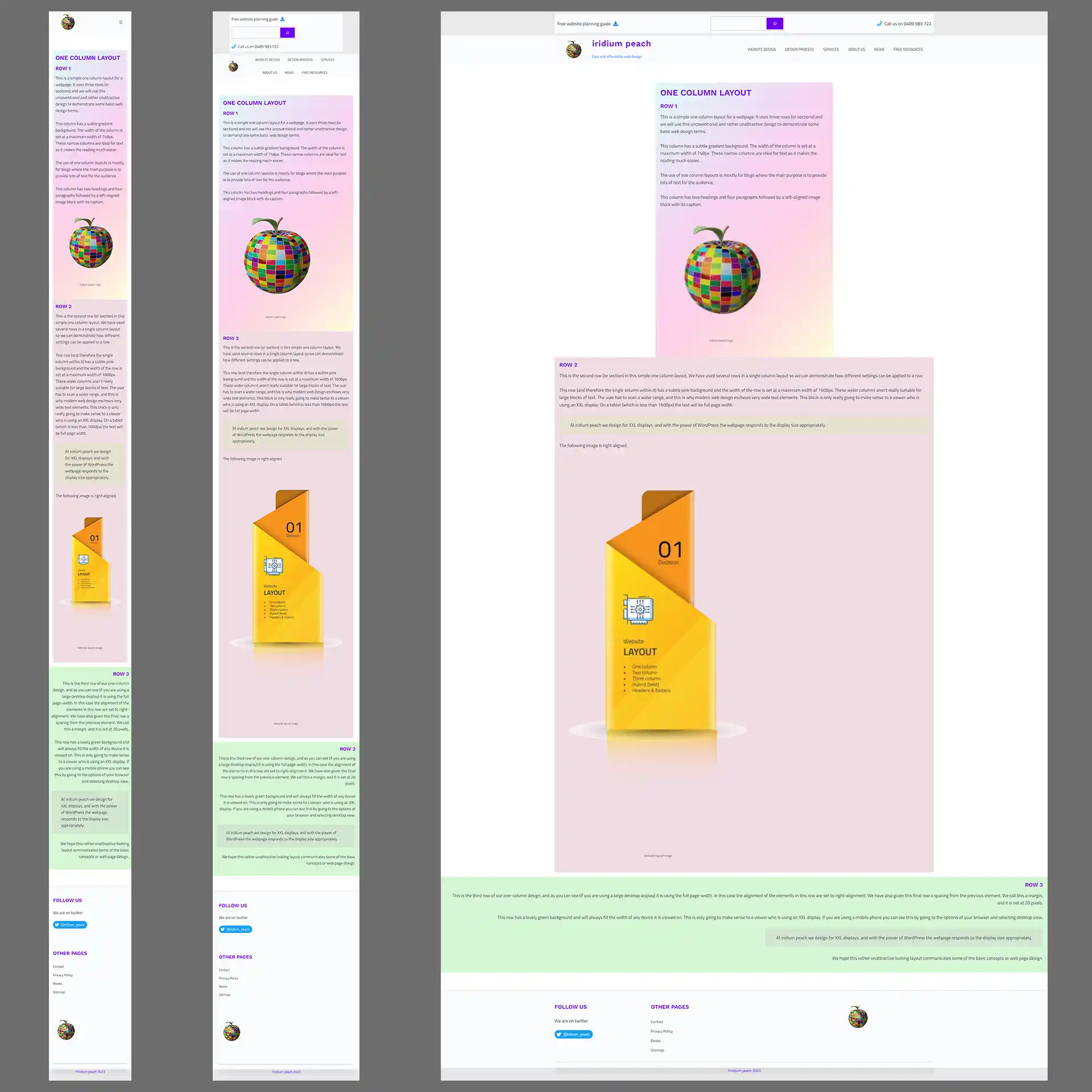
Here is an image which is three screenshots of the same page. The difference is the first is a mobile phone, the second is a tablet and the third is an XXL desktop display.
As you can see the mobile and tablet are similar in layout. The XXL desktop is noticeably different. That’s because the three rows were given a different width which only becomes apparent on a large display. Behing the garishly colored rows is the page color background (near-white).
The width of row 1 was set to be no more than 748 pixels.
The width of row 2 was set to be no more than 1600 pixels.
The width of row 3 was set to full-width.
There are a multitude of settings we can use to create beautiful designs with thanks to the amazing power of WordPress.

Two column layout
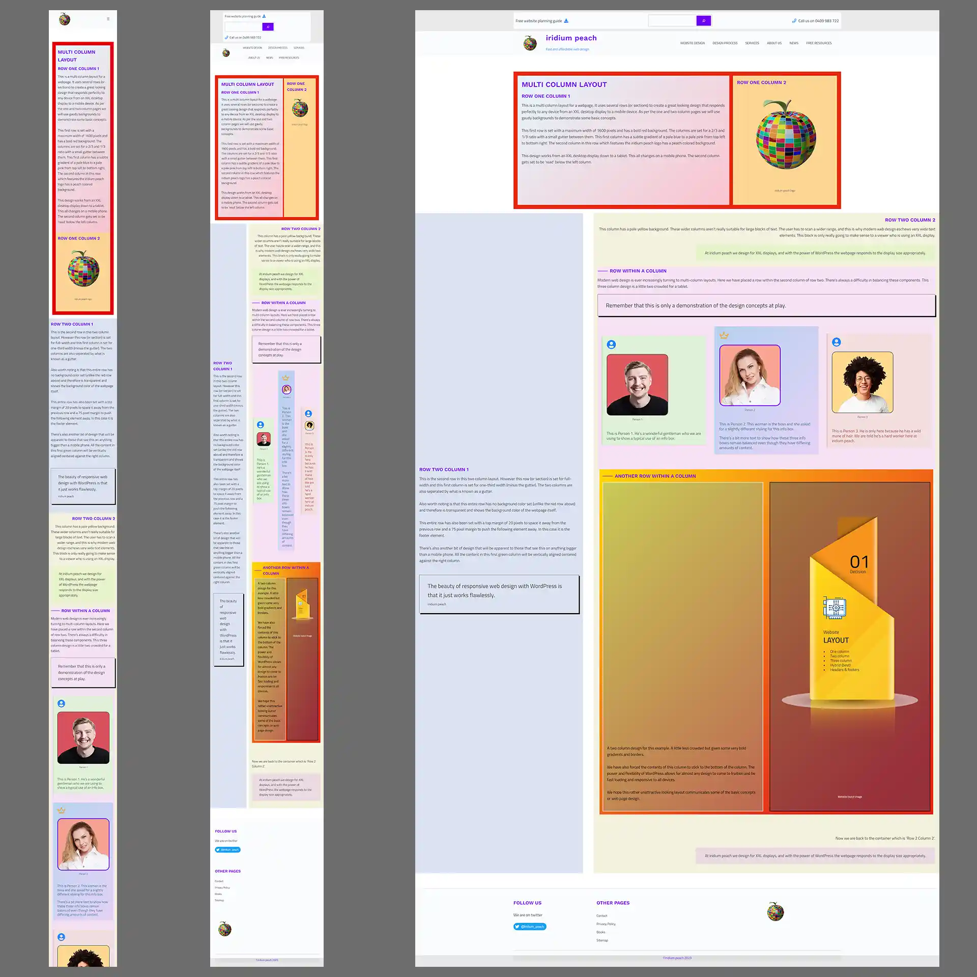
With the two column design we can see what a responsive design looks like between the three devices. The first row has a red background, within that row are two columns which have a gutter between them. That gutter disappears on the mobile phone and the second column gets ‘read’ by the mobile phone’s browser below the second column.
On the tablet and the desktop the first row maintain their 2/3 and 1/3 ratio and all the content is managed by WordPress. You will also see a similar thing with the second row.
The width of row 1 was set to be no more than 1600 pixels.
The width of row 2 was set to full-width.
The layout pages aren’t designed to be beautiful. They’re designed to demonstrate the concepts of web page layout

Multi column layout
The best design is the multi column design. It allows for the most creativity. As with all of the work we do the pages are suitable for viewing on all devices and are designed for XXL displays and then tweaked for tablets and mobile phones.
The width of row 1 was set to be no more than 1600 pixels.
The width of row 2 was set to full-width.
As a side note many of the pages on the iridium peach website use a multi column layout set at a 1600 pixel width. But where needed we use the full-width option.

